PORTFOLIO

Our goal was to position Harris as the school for fearless thinkers who want to turn their passion for social good into measurable impact via a user experience that feels intuitive, engaging and useful.

Our goal was to progressively audit designs/components being used throughout the enterprise and coalesce the best solutions into one design system.

Previously, "Handwriting Without Tears," the company needed a refresh of its website and brand to better reflect its mission of helping Pre-K–5 students become confident communicators.

For the PSI redesign, our team was tasked with creating a site than would engage small donors, while not alienating their traditional large donor base. In essence, it was a balance between a very informed, policy-oriented group who rely on data and results, and that of a lay one who are more motivated by human-interest stories.


The Public Company Accounting Oversight Board's old website was outdated and needed a refresh. Information was fragmented and hard to find, there was a lack of cohesion in the visual design, and there wasn't enough context for users to efficiently complete their tasks. In order to get the new site to a better place our team decided to break up the redesign into two phases.

Co-Founded Mediatr.
Mediatr is a lawtech company that's changing divorce mediation with our platform that replaces face-to-face sessions with legal professionals.


In order to make financial statements of companies more transparent, PCAOB leadership tasked our team with creating a way for institutional investors and academic researchers to access very specific information about an audit between an auditing firm and a publicly traded company.

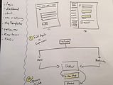
The KWT app needed better onboarding experience. My first step was to map out the exiting process from purchase to fulfillment to activation & use and conduct user research and testing. Using this information, our team was able to identify gaps in the onboarding experience and focus our time on those areas.

Real estate investment is an increasingly popular way for individuals to achieve financial security. At the same time, for non-professional investors, real estate can be a complicated industry. This app will allow them to get started before reaching out to professional real estate agents.

The KWT app had grown organically over the years and lacked a consistent look and feel. One of the first steps in addressing this was to create a consistent style and interaction for modal windows, messages, header and subnavigation.

In an effort to incentivize users to extend their free trials and to spread the word about this new product, I created these pathways. Each call to action is rewarded with an extension to the trial.

Several standalone products needed to be integrated into a new tool to create an interactive handwriting ecosystem that allows teachers to seamlessly move between products.

The redesign of globalchange.gov was a collaboration between 13 agencies, 2 design firms and countless stakeholders. Challenges ranged from project coordination / stakeholder management between agencies, to collaboration on design vision and implementation between design firms.


This tool was designed to help USAID program managers make sound decisions about climate change during their planning activity phase. Several workshops were held, as well as an analysis of their existing documents to create a streamlined tool that allows teams to collaborate online.

The ENERGY STAR KIDS website was developed to provide a fun and friendly environment for kids to learn about the problems facing our planet. The idea being that if you provide a fun environment that allows kids to interact, get involved and play games it will help educate and motivate them to be environmentally conscious citizens.


Company needed a way to allow employees to schedule ad-hoc ping pong games with other employees and record the results of matches. The goal is to encourage socialization, i.e. meet new people / strengthen existing relationships.


CDC Health Data
CDC has a vast collection of health-related data by state. The challenge was how to expose that data in a user-friendly way that could motivate public health officials to take action. To this end, we created a widget that can be embedded in partner sites which provides a compelling visual comparison between a state and the national average.


DCIPS Performance Appraisal Application
The Defense Civilian Intelligence Personnel System needed to upgrade their current application and process for evaluating employees. We created this prototype with the goal of moving the mental burden off the users and onto the application. Extensive process modeling and user testing was done to ensure that our proposed design and process was as intuitive as possible.
My Role | UX Designer: Heuristic evaluation, Business process modeling, Usability testing, IA, Prototyping

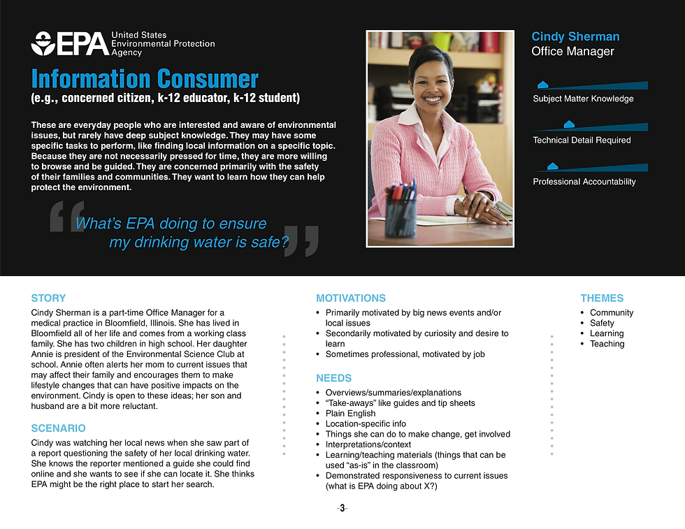


EPA Personas
These personas were developed for EPA in order to help focus their writers, designers and developers on the needs, motivations and behaviors of their target audience. Extensive statistical analysis and phone interviews were conducted in the months prior to creating these personas. Guidance on how to use these was also delivered.
My Role | UX Designer: Interviewing, Task analysis, Content creation, Wireframing


MSH
For the MSH redesign, one-on-one interviews were conducted, followed by group discussions with staff to understand their goals for the new site. There was also a complete evaluation of their content to steamline and priortize key items. Next, we held a series of brainstroming sessions resulting in more refined proofs of concept for key sections of their site.
My Role | UX Lead: Research, faciliation, strategy, IA
Website | www.msh.org

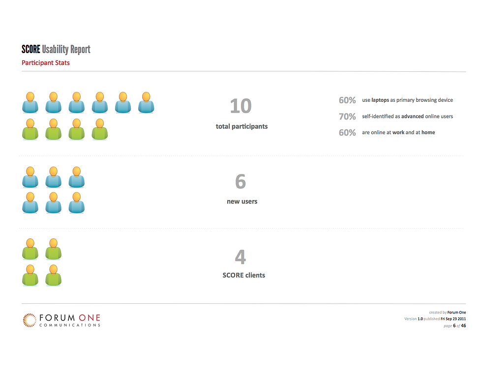


Usability: SCORE
An assessment of the usability of SCORE's website was done to test our assumptions about its perceived issues. Over 4 days, 10 participants were guided through a one-hour usability test, involving free exploration, task completion and open discussion. Concrete recommendations for improvement were based partly on these obervations.
My Role | UX Lead: Test prep & planning, faciliation, analysis, report creation & presentation
Website | www.score.org


Usability: ASPCA Puppy Mills
The goal of this usability test was to determine the effectiveness of the ASPCA's Puppy Mill campaign website. Sessions were conducted over a period of 2 days at ASPCA headquarters in NYC. Nine participants were guided through a one-hour usability test, involving free exploration, task completion and open discussion.
My Role | UX Lead: Test prep & planning, faciliation, analysis, report creation & presentation
Website | www.nopetstorepuppies.com


Change the World Campaign
Every year Energy Star launches a campaign called, "Change the World," aiming to get consumers to alter their energy consumption behavior. Our job was to partially redesign the site and get people to take the pledge to reduce their energy footprint.
My Role | UX Lead: IA, Design Communication & Coordination
Website | www.energystar.gov/changetheworld