


The Public Company Accounting Oversight Board's old website was outdated and needed a refresh. Information was fragmented and hard to find, there was a lack of cohesion in the visual design, and there wasn't enough context for users to effectiviely complete their tasks. In order to get the new site to a better place our team decided to break up the redesign into two phases: Phase one would focus on triage, getting the site cleaned up and organized with a few new features and a new look. Phase two will focus on refinements and enhancements borne out of our research during phase one.
My Role & Activities
Lead UX Designer| User research & interviews, task analysis, business goal workshops, branding & messaging workshop, content audit, design brief, personas, sketching, wireframing & HTML prototyping, style guide.
Problem
Information was scattered amongst a sea of text and links without much context. Lots of redundant and outdated content existed and there was a lack of agreement and understanding about who the website should primarily serve. There was also differing ideas about what the purpose of the website should be in fulfilling PCAOB's mission.
Solutions
-
Create a shared understanding of who the primary users of the site are and what their main goals, motivations and tasks are. This was done through several workshops using KJ and Task Analysis. Individual interviews were also conducted with key stakeholders. A set of personas were created that reflected these audiences.
-
Identify and agree on PCAOB's primary strategic goals, brand and messages to ensure the site focuses on the right things and communicates them effectively. Branding workshops were the primary vehicle for doing this. Strategic pillars were created to help authors, editors and the design teams stay focused and make informed decisions about content and design.
-
Mega menus and landing pages were developed to provide users with a proper orientation of the main sections and put users on a clear path to completing their key tasks. Information was reorganized to make the "scent of information" stronger.
-
A fat footer was designed to provide users quick, global access to lower priority but important content.
-
The homepage was reimagined to reflect the new priorities of PCAOB.
-
A backlog of features for phase two was compiled, which include: records & filings section, audit quality check, quick start for new firms, top tasks pathways, and search enhancements.
Project Artifacts
 Screen Shot 2018-02-20 at 10.58.25 AM |  Screen Shot 2018-02-20 at 10.59.11 AM |  Screen Shot 2018-02-20 at 10.59.23 AM |  Task Analysis Overview |  Auditor Tasks |
|---|---|---|---|---|
 Auditor Outcomes (pre sort) |  Auditor Outcomes |  Investors Outcome |  Public Company Outcomes |  Registration ProcessStory mapping the registration process over time |
 Migration | 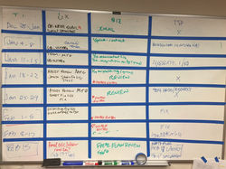 Release Plan |  Task AnalysisBreakdown across audiences |  Task AnalysisEvaluation of feasibility |  Task Analysis Summary |
 Task Comparison |  Audience Matrix |  Audit CommitteePersona |  Auditor Persona |  Job Seeker Persona |
 Branding WorkshopTerm comparison |  Strategic Pillars |  Homepage Options |  Home Option 1 |  Home Option 2 |
 Home Wireframes |  Home Comp 1 |  Home Comp 1.2 |  Home Comp 2 |  Content Type Overview |
 Content ModelLarge Feature |  Content ModelSmall Feature |  Content ModelNews |  Homepage Rules |  Navigation Details |