


Transparency Project
In order to make financial statements of companies more transparent, PCAOB leadership tasked our team with creating a way for intitutional investors and academic researchers to access very specifc information about an audit between an auditing firm and a publicly traded company.
My Role & Activities
Lead UX Designer | User research & interviews, survey, facilitation, goals workshops, personas & scenarios, journey mapping, sketching, wireframing & prototyping
Problem
PCAOB received negative feedback in an article about the challenges of finding information on their website. The SEC, who oversees PCAOB's budget, put pressure on the organization to find a solution. Around the same time, an initiative was underway that would provide more transparency about the individuals at auditing firms who lead the audits of companies. These individuals are known as "audit partners." Making this information public is important for institutional investors and academic reseachers, who rely on it to make informed decisions about companies, and analyze trends/patterns. An additional challenge was the project's focus seemed too narrow. Help was needed to put the effort in context of larger audience goals, not just the specific tasks.
Solutions
-
Rather than a static table of audit partner information, I proposed creating a dynamic search feature tailored to this information.
-
To further assist users, I proposed utilizing type-ahead autocompletion, integrated it into one search input rather than taking users to multple pages or tabs.
-
Stakeholders were used to only talking about goals and requirements. To facilitate the group's understanding I visualized many aspects of the project, inlcuding: goals, users & their info needs, user journeys and a clickable prototype. The project sponsor heaped on high praise for these efforts and remarked how much easier they made his job when presenting our proposal to the SEC.
-
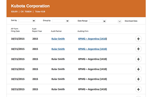
I proposed creating 3 new specific content types / landing pages that would make organizing and searching information much easier; these included: Firms, Audit Partners and Companies. These pages serve as one-stop shopping hubs of related information rather than scattering those pieces of information around different locations. Also, these hubs will be crucial once this search is integrated with the main site search.
-
With the visual assets I mentioned, I was able to facilitate several workshops and got stakeholders to consider things they've never thought of before, like the words their users understood (and didn't), their mindsets and time constraints. This was key in getting takeholders to empathize with the realities of their users' journeys and build something that actually met their needs and goals.
Project Artifacts
 MVP Quality |  Firm Relationships |  Planning |  Goals-Process |  Shared Understanding |
|---|---|---|---|---|
 Journey High-level |  Journey |  User goals-needs |  User Needs |  Journey Map |
 Conceptual Options |  Screen Inventory |  Concept Option Details |  Sketch2 |  Sketch |
 Steps in Process |  Search Home |  Type Ahead 2 |  Type Ahead | 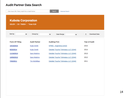 Company Page |
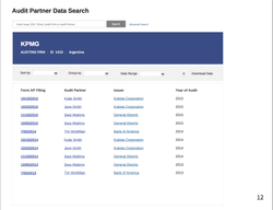 Firm Page |  Audit Partner Page |  Form Output Detail |  Detail Alternative |  Detail Alternative 2 |
 Advanced Search |